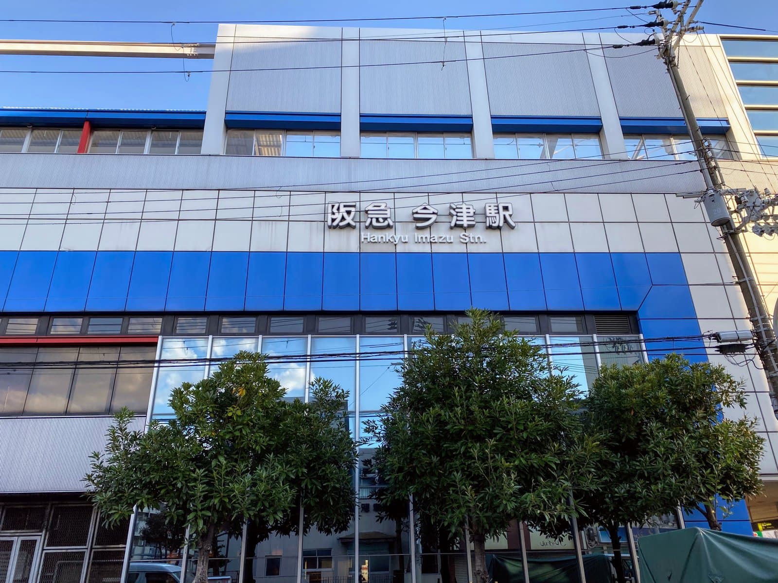
The signs(station name signs) on the platform at Imazu Station have changed.
(This tip came from Kagayaki 509-go, a Nishitsu supporter. Thank you!)
This time, it’s this!
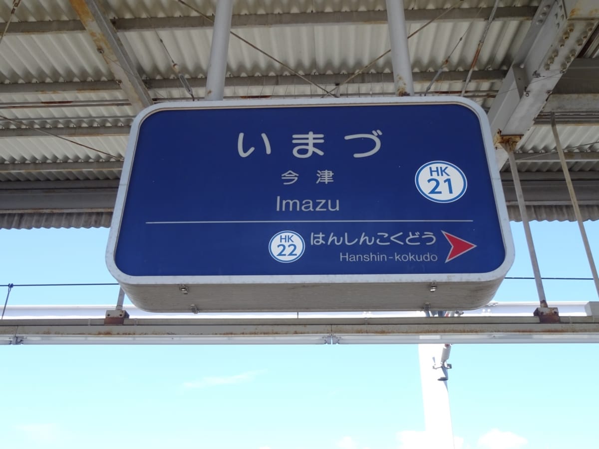
This one↓
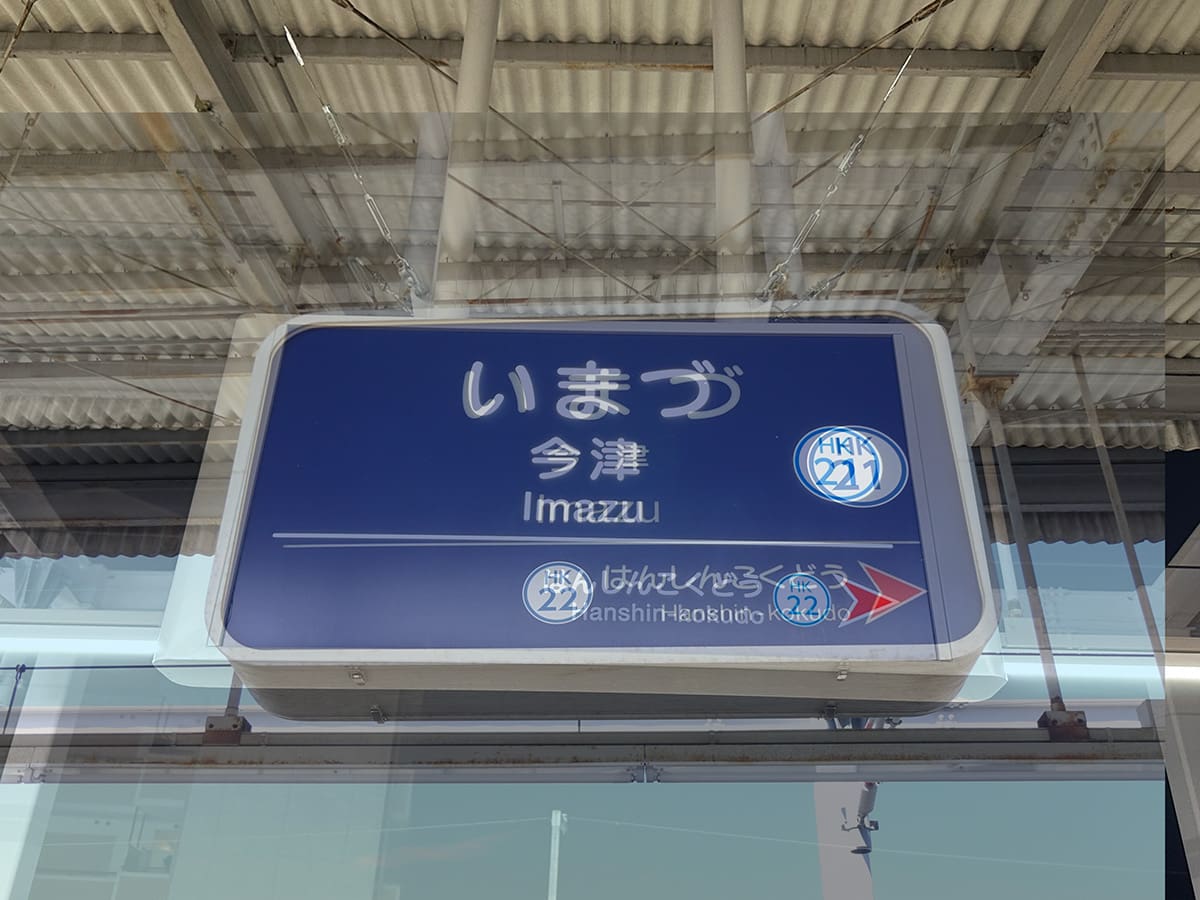
And this one↓
Can you tell what changed?
For those who can’t tell, let’s overlay the photos.
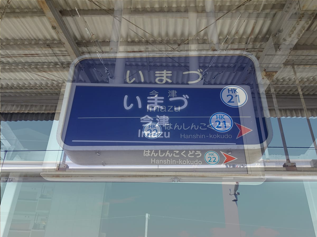
That was pretty rough.
Sorry. I’ll do it properly.
Could you spot the difference?
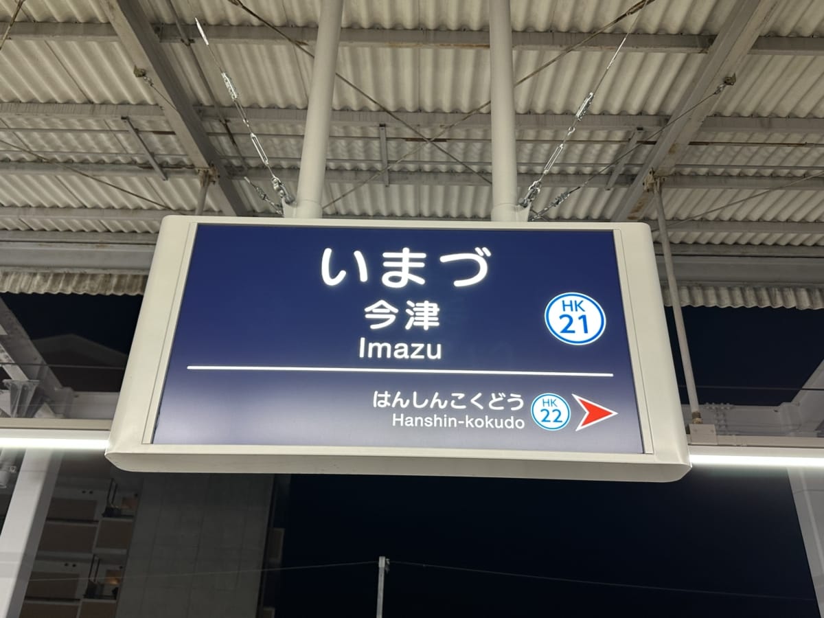
The previous design↓
The answer is the part where “HK21 and HK22” are written. This is called station numbering, with the letters “HK” standing for the company name, Hankyu, plus a two-digit number for the station number.
The latest design↓
Also, it’s more squared off and lighter. Looks sharper.
The station signs were updated in March 2023, and apparently they adopted a universal design font that’s easy for everyone to see and read. By the way, the previous update was in 1995, so this was the first one in 28 years. They were actually pretty old.
*Kagayaki 509-go, Nishitsu supporter, thank you for the tip!!
■■■We’re looking for tips!■■■