
You’ve probably seen Nishinomiya address signboards before, right?
Usually they look like this↓
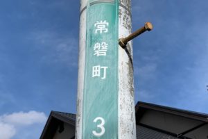
Anyone would probably say it’s more of a green color.
But somehow, this one looks kind of blue!
And it’s hanging by a string, giving off a pretty worn-out vibe (゚o゚;; Sorry to the neighborhood association for putting it that way…
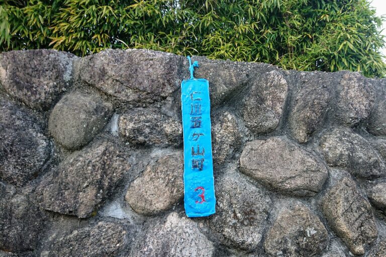
A normal “Nigawa Gokayama-cho” sign looks like this!
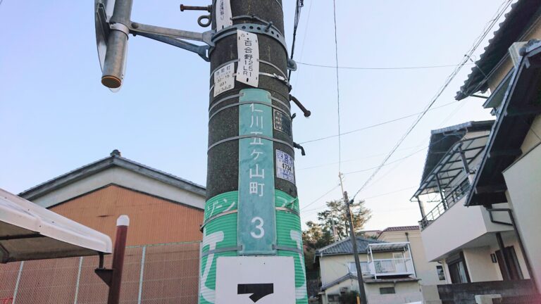
Why! Why is only this one like that?
So while thinking that and taking a photo from farther away,
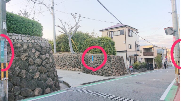
There are three different town-name signs in a single photo!
“© OpenStreetMap contributors”
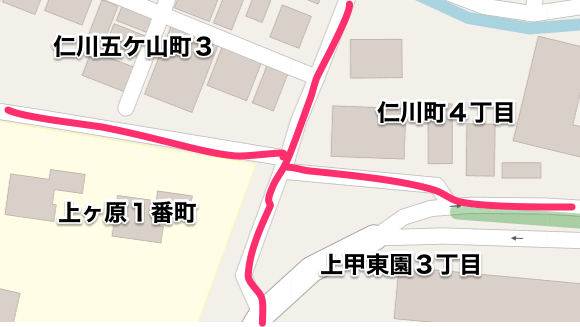
When I checked the map, it turned out to be the border of four different towns (^O^)/
Here’s the location↓
It’s in the direction of Nigawa, to the right after facing Kwansei Gakuin’s main gate!
I ended up saying something rude like “it’s trying to stand out,”
but for people working in delivery, it must be really easy to understand and pretty helpful〜(^ ^)